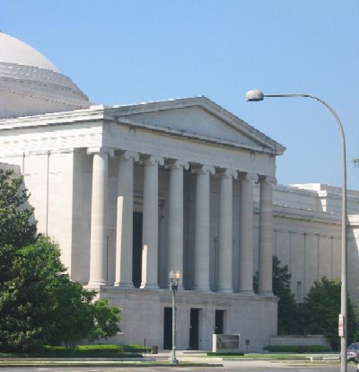
The National Building Museum has always done remarkable exhibitions. They’re ambitious, make good use of a diverse range of artifacts and images, and take on interesting topics. Their exhibit budgets are fairly low, the production values fairly high. And, at least until fairly recently, there were many of them. The Building Museum always had something new. I used to wonder why they didn’t leave the exhibits up longer.
“Liquid Stone: New Architecture in Concrete” is a typical NBM exhibition. It’s less historical than some, but it combines architecture, building technology and history in the NBM way. (It’s weak on the work story, which is too bad: it would have been interesting to know about who does this work.) It also combines photographs, models, art installations, video, and materials in a typical NBM way. It’s unusual in its organization: structure, surface, sculptural form and the future, Bt that structure comes naturally out of the subject matter, and it works: the buildings used as examples clearly tell the story they’re supposed to.
It would have been nice to know more about some of the buildings. The photographs and the descriptions read like architectural magazines; it’s all about the designer. And even the designers don’t have much voice here; the curator’s voice is the only voice. I would like to see a bit more about the engineering, about the firms that moved these buildings from architectural scheme to concrete reality. What role do engineers play? How are decisions about materials made? It would be good, too, to know about what happened after the building was built. Was the design a success?
The design of the show is solid, its thick grey walls reflecting the solidity of its subject matter. The installations of concrete slabs and rebar add a nice touch. Materials in general were appropriate. There are many wonderful samples of concrete to touch. But there are others that cry out for touching with large “don’t touch labels” on them. Confusing.
Maintenance was only fair; the exhibit is showing its age. About 10 percent of the bulbs had burned out, and some video screens were blank. The silence of the show was remarkable; it made me realize how much I’ve come to expect (and enjoy) sound in exhibitions. Here, the only sound was the hum of video projectors. Another complaint: no place to sit in a long and detailed show. Why no concrete furniture?
The exhibit is sponsored by LaFarge, a concrete producer, and two of LaFarge’s products are featured. The display seemed appropriate, though. I don’t know whether competitors might complain about the choices.
“Liquid Stone” closes in January 2006; it’s worth a visit.
“Washington: City and Symbol,” on the other hand, is a design disaster. The most common failure of exhibition design is trying to jam too much into too small a space, and the “City and Symbol” shows why that’s bad. The first wall in the exhibit, only about 15 feet long, had more than 50 images, labels, descriptions, videos, and objects. And it only got worse from there. The show’s just too small for what it’s trying to do, and it’s trying to do too much. Juxtapositions are occasionally bizarre: the poorly defined sections blend together.
Defining the sections to break a story into is often the most difficult part of creating an exhibition, and “City and Symbol” shows what happens when that’s not done well. I couldn’t figure out the categories of the exhibit, and the examples in each category seemed chosen at random. Why should “Education, Religion and Recreation” be only about African Americans and Jews?
I didn’t spend much time in the show; it was too confusing, too busy. I did enjoy the raised maps and some touchable models—the maps were the best I’ve seen for the visually impaired. And a blind visitor wouldn’t have to worry about the confusion on the walls around him or her, either....


